Welcome to The Helios Blog, your go-to graphic design and branding resource.
When you launch a business, one of the most critical steps is creating your visual
identity. Your logo is the absolute face of your brand. It makes the very first
impression on potential clients, communicates your values, and sets you
apart from your competitors.
But how do you create a design that actually works? In this detailed guide,
we break down the fundamental rules of logo design, explore the different
types of logos, and share the secret design formulas in simple, plain English.
Welcome back to The Helios Blog, your ultimate destination for branding strategies and graphic design insights.
When you look at some of the biggest companies in the world—like Google, Coca-Cola, NASA, and Visa—you
will notice something incredibly interesting: their logos don't have icons, animals, or abstract shapes.
They rely entirely on text.In the graphic design world, this is known as a Wordmark (or a Logotype).
Because a wordmark has no pictures to hide behind, it is one of the purest and most challenging forms
of graphic design. In this detailed masterclass, we will unpack exactly what a wordmark logo is, why it
works, the psychology behind it, and how to create a highly optimized font-based logo for your brand.
Why it works: It is excellent for brand recognition. Because your
logo is your name, people learn your company's name every single
time they look at your logo.
When to use it :
• If your business has a short, catchy, or unique name.
• If you are a new business and want people to memorize your name quickly.
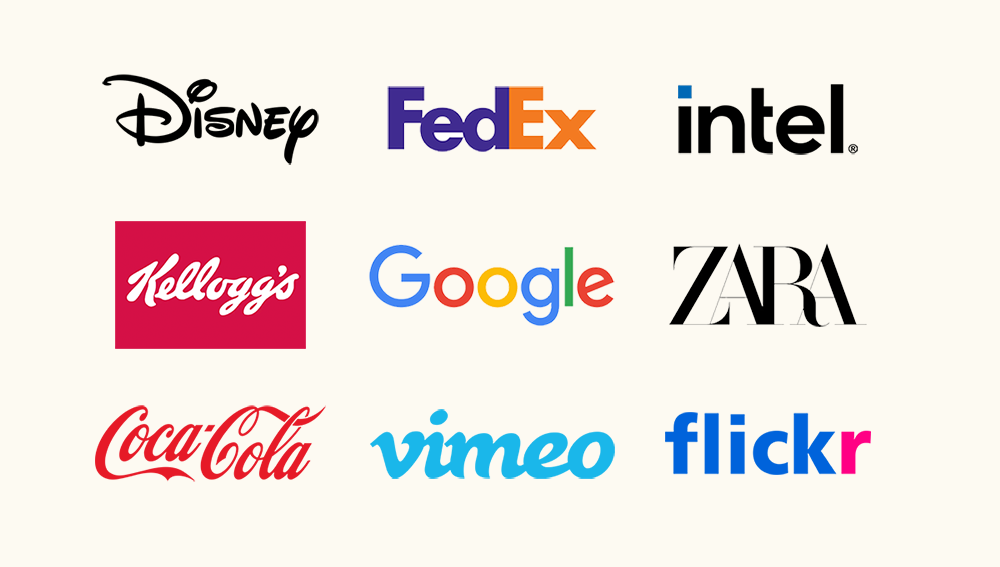
While wordmarks are incredible, they aren’t the perfect fit for every single business model.
Here is a quick reference checklist to see if a text-only design is right for you:
Because there is no picture to hide behind, the typography
must be perfect. It needs to be incredibly easy to read whether it is printed on a
massive billboard or a tiny smartphone screen




Related Blogs