Welcome to The Helios Blog
Have you ever noticed why tech giants like Facebook, LinkedIn, and PayPal, or financial institutions like
Chase Bank and Visa, almost exclusively use shades of blue? It isn't a coincidence or a matter of
personal preference. It is a calculated deployment of psychological triggers.
Color theory is the combined science and art of how colors interact, how they mix, how they display on
digital screens versus physical print, and—most importantly—how they influence human behavior and
emotion. If you are building a website blog, establishing a new startup, or launching an online store,
choosing your brand’s color palette is one of the most critical decisions you will ever make.
1. The Starting Point: The Color Wheel
A. Primary Colors (The Parents)
B. Secondary Colors (The Children)
C. Tertiary Colors (The Mix)
A. Primary Colors (The Parents)
These are the three foundational colors: Red, Yellow, and Blue. You cannot create these colors
by mixing other colors together. They are the "parents" of every other color on the wheel.
B. Secondary Colors (The Children)
When you mix equal parts of two primary colors, you get a secondary color:
-
• Red + Yellow = Orange
-
• Blue + Yellow = Green
-
• Red + Blue = Purple
C. Tertiary Colors (The Mix)
-
These happen when you mix a primary color with a secondary color next to it. This gives
-
you two-word colors like Blue-Green, Red-Orange, or Yellow-Green.
-

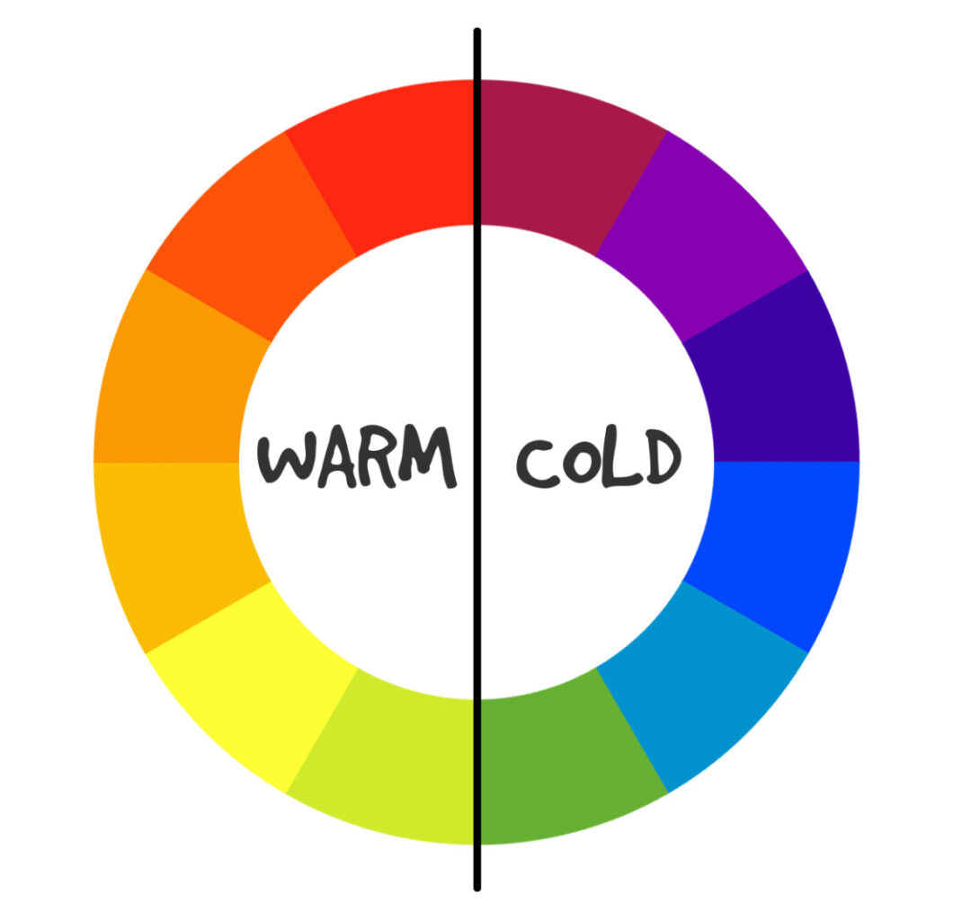
2. Color Temperature: Warm vs. Cool
The color wheel is split right down the middle into two moods: Warm and Cool.
Warm Colors:
• These are colors like Red, Orange, and Yellow. They remind us of
sunlight, fire, and heat. They feel energetic, loud, exciting, and welcoming. They naturally jump out at you.
Cool Colors:
• These are colors like Blue, Green, and Purple. They remind us of water, grass, and the night sky. They
feel calm, peaceful, professional, and quiet. They tend to sit back in the background.
The 3 Simple Words Designers Use for Color
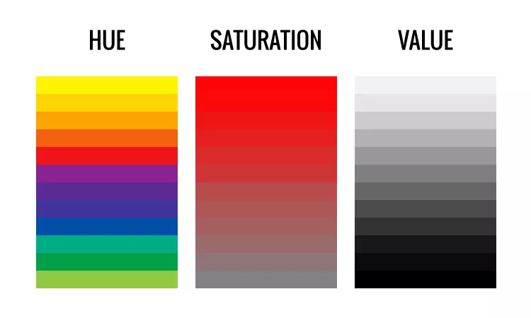
When you pick a color on a computer, you will often hear three words. Knowing what
they mean makes adjusting your designs incredibly simple:
1 Hue
This is just a fancy word for the actual color name (like "Green" or "Blue").
2 Saturation
This is how intense or vibrant the color is. High saturation means the
color is super bright and vivid. Low saturation means the color is washed out and closer to gray.
3 Value
This is how light or dark a color is.
• Adding White to a color makes a Tint (like turning red into soft pastel pink).
• Adding Black to a color makes a Shade (like turning red into deep burgundy).




Related Blogs